
A Guide to Acceptable Barcode Color Combinations
Barcode colors aren’t just about design—they directly impact scan accuracy and operational efficiency. This guide explains the best and worst barcode color combinations, showing how poor contrast or reflective materials can lead to scanning errors, product rejections, and workflow delays. Learn which color pairings to use (like black on white) and avoid (like red on green), and get pro tips for testing and verifying your barcodes. With proper color choices, your barcodes stay compliant, readable, and reliable—keeping your business running smoothly.
Barcodes appear everywhere, from product packaging to inventory management systems, playing a vital role in keeping things organized and running smoothly. However, one often overlooked detail remains the color combination used in printing barcodes. Choosing the wrong colors leads to unreadable barcodes, causing scanning failures and operational hiccups.
We’ll guide you through the best color combinations for barcodes and explain why getting the colors right is essential for your business.
Why Color Matters in Barcode Printing?
Scanners read barcodes by using a light source, typically red or near-infrared light, to detect the contrast between the dark bars and the light spaces. The scanner’s ability to correctly read a barcode relies heavily on this contrast.
If the colors for the bars and spaces do not provide sufficient contrast, the scanner may fail to read the barcode accurately, leading to delays, errors, or rejected products in the supply chain.

Key Considerations for Barcode Color Combinations?
To ensure that a barcode is readable, it is important to follow certain guidelines for color combinations:
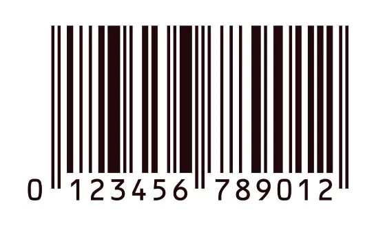
| SAMPLE | BARS COLOR | SPACES COLOR | REASON |
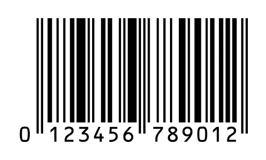 |
Black | White | High contrast; ideal for readability and scanning. |
 |
Dark Blue | White | Provides good contrast similar to black bars. |
 |
Dark Brown | White | Acceptable with sufficient contrast. |
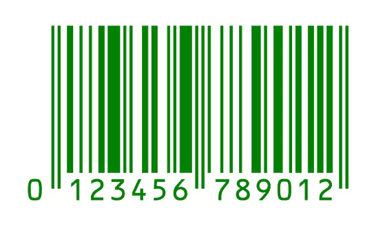 |
Green | White | Green bars on white can work if dark enough for contrast. |
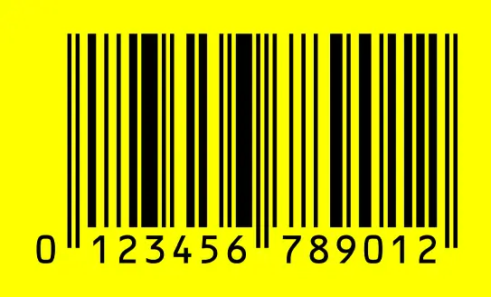 |
Black | Yellow | High reflectance and adequate contrast for readability. |
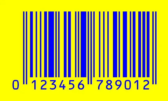 |
Blue | Yellow | Sufficient contrast with light backgrounds. |
| SAMPLE | BARS COLOR | SPACES COLOR | REASON |
 |
Red | White | Red bars reflect scanner light, making them unreadable. |
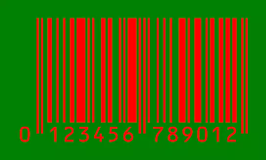 |
Red | Green | Insufficient contrast; red is too reflective in scanner light. |
 |
Black | Green | Dark colors on dark backgrounds lack sufficient contrast. |
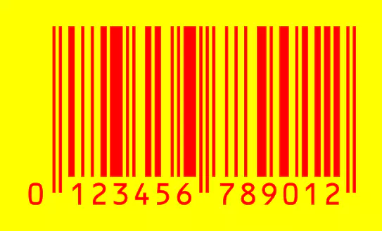 |
Red | Yellow | Poor contrast, especially under red light scanning. |
| Light Colors | Dark Colors | Light colors do not absorb enough light for clear scanning. | |
| Metallic Colors | Any Background | Cause specular reflectance, hindering scanner readability. |

Why the Right Color Combinations Matter
Using the correct color combinations in barcode printing is crucial for several reasons:

Pro Tips for Testing Barcode Colors
Common Pitfalls to Avoid in Barcode Printing

Getting the colors right for barcode printing isn’t just about aesthetics – it’s about making sure your barcodes work correctly every time. By sticking to the best color combinations and avoiding common pitfalls, you can ensure your barcodes are always readable and scannable, keeping your operations smooth and efficient.
For expert guidance on barcode printing and verification, Intermax is here to help. Contact us today to ensure your barcodes meet the highest standards and avoid costly scanning errors.
Upgrade your Barcode Verifier Today!
Stay GS1 Compliant, visit barcodeverification.com.au now.
Or


